The Age Of Simple Products And Even Simpler (If Any) UI
I don’t know exactly where it started. It might have been with Google’s homepage.


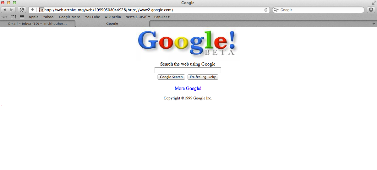
Back in the 90’s, good portals were Altavista, Yahoo and Lycos. Google was something really new back then, that — compared to “the big guys” — was just a text-only homepage with one large input box and a Search button.
However, few years later, I came in contact with DigitalOcean and Dropbox. And then Medium and Ghost. They all have one thing in common: UI Simplicity. These products have a UI that feels like a breath of fresh air in the morning. Like a clean work desk, like Windows 95’s default background. Clean, simple, easy to grasp and understand. I believe that was my “Aha!” moment regarding UI.

And it hasn’t stopped fascinating me ever since. Monitive was already built using a “fairly simple” interface; one that is still considered simple and neat by some customers, unfinished by others, and even outdated by some. You can’t blame them. It’s 2010 material, four years before the “Material Design” concept was even sketched.
I’m not a UI/UX Designer. I truly suck at design. About twelve years ago, I built a website for a friend who has an event planning business. When it was done, and he came to see it, I was so embarrassed about how the final product looked that I refused to show it to him. That’s when I acknowledged to myself that this was probably never going to be one of my strengths.
Fast forward ten years: I know some basic design principles, guidelines and best practices, but my brain just can’t come up with something on its own when it comes to aesthetic creativity. And that’s OK, because there are truly talented people out there and we already know that everything is a remix.
So, ever since I’ve seen how simple a VPS’s managing platform UI can be (DigitalOcean’s), I always dreamt about stirring Monitive’s UI in that direction. I mean, the very reason behind founding Monitive was to create a simpler, better service than those who — back then — were engineer-friendly-only, over-complicated and not to mention expensive. But seeing actual services that masterfully checked the “simplicity” checkbox was something else. It was real, live proof to me that it can be done and that it is the way to go. If deploying and managing Virtual Private Servers got that easy, uptime monitoring surely couldn’t be more complicated.
The online publishing industry also has its spikes and sparks, and I’ll just mention two of them: Medium and Ghost. There’s nothing like a publishing platform that’s clean and gracefully embeds whitespace to the sole purpose of promoting the one thing that actually matters: The story. The content. The words.
Think back about the time when the first iPhone was launched. “What? A smartphone with just one button?” In the age of Blackberry and T-Mobile Sidekick, a phone that shouts “I’m the next generation phone,” with just one big button, clearly provoked a lot of frowns among the mobile industry. Not to mention that it had very few features compared to the flagship phones at the time.
But surprise — it caught on! Because it seemed simple to work with. It was addictive and it was creating habits. Its grand-grand-son, iPhone X, launched not long ago, still follows that pattern.
Complex and powerful under the hood, dead-simple to use by its users.
This — the thirst for simplicity and performance — has been one of the reasons why we’ve started rewriting Monitive from scratch, both the concept and the technical layer behind it. I am confident that this new product will enable us to deliver what was always our mission: To bring value and peace of mind to our online customers. I’m really eager to get it up there, in front of you, our users.
The best interface is no interface
For years I have lived with a wrong ideal of what constitutes a great app. I’m talking about User Engagement (or Customer Engagement). Experts always stated that you, as a Product Owner, need to find ways to determine how the customer use your application every day. Because otherwise, they’ll start forgetting that you exist, and eventually cancel their subscription. Which leads to a high churn rate and finally — if you can’t keep on-boarding new customers — bankruptcy.
Looking at Monitive, the churn rate has always been insignificantly low. The product itself could benefit from improvements, however customers seemed to be really satisfied with the product, even though most don’t need to use it on a daily basis.
This is because Monitive is the kind of service that is in the “setup and forget about” zone. Once you have set it up, its purpose is to check your sites and services every minute and let you, the customer, know when something’s not right.
Then, one day, I read Golden Krishna’s article “The best interface is no interface” a truly mind-opening post that essentially says “if users don’t need to physically interact with your product (ie. start your app to perform their tasks) then you’ve nailed it!”
I recommend reading it, as it brought another “Aha!” moment to me. That’s when I realized that Monitive does fit this pattern. You don’t have to pull out your phone, swipe to unlock, search for the Monitive app or website, open it, wait for it to load, figure out how to do what you wanted to do, and do it. Besides the initial setup, our customers don’t have to do anything at all to use Monitive.
They are using Monitive even when they sleep. It’s how it works. And that’s truly wonderful.
Going even further, whenever an outage occurs, we provide all the information we have in the alert email: reason for the outage, duration, location where this was identified from, even quick links to easily add a note or tag.
Based on the “make your users use your product daily” rule, we would have been doing it wrong.
Until learning “the best interface is no interface” idea, I always felt daunted that we’re giving away too much information in the email, thus not motivating the user to use our app for that information. I felt that I had failed at Customer Engagement. I was wrong.
Now, to prove my theory, I have seen examples of a similar service that actually enforced the Customer Engagement rule, in our area of expertise: uptime monitoring. Their alert email contains minimal information and a “Log in to see details” link. It actually forces the user to: (1) tap the link, (2) remember the login credentials, (3) type the credentials in, (4) click Log in, (5) figure out how to use the app’s interface, (6) navigate to the right page or screen that shows the details, (7) read the details and (8) take action based on what they’ve found out. Now, isn’t that a mouthful!
They actually did the “make the user engage with your app” thing right, by forcing users to use their app when they received bad news: “Hey, your site is down! Wanna know more? Do this and that!” However, they failed miserably at creating an easy-to-use service with no interface, that aims at bringing peace of mind and simplicity to the customer’s life.
That, in my opinion, is the greater goal here.
This is just one example. In the next few days, just pay attention to how many services and apps lure you to log in or use their app to achieve the task you’re aiming for. “Haven’t seen you in a while,” “Come back and check out…” and some other messages have one thing in common: They’re all struggling to form a habit within your daily routine, just like most users of Facebook and Twitter often find themselves scrolling down the timeline without being able to remember why they started doing that in the first place. Yes, they wanted to be up-to-date with news and updates, but… seriously… fifty times a day?
There is no one-size-fits-all in Product Development. For instance, a to-do app actually needs users to interact with it on a daily basis. Using a to-do app twice a year is the same with not using it at all. If you truly want to use an app you have to form a habit of using it. That’s why I try to understand every concept that I learn along the way, to see if and how it applies to my product.
I advise you, dear reader, to do the same.
–Photo by Samuel Zeller on Unsplash