How to build a CSS-only responsive website navigation
Inspired by Dirk Olbrich’s Hugo Starter Theme with Tailwind CSS this works by displaying a regular navigation bar on landscape tablets and desktop resolutions, but changes into a nice dropdown on mobile resolutions.


In the new light of website performance that I’m pursuing, I have learned to avoid Javascript at all costs. Here’s a nice Javascript-less desktop and mobile navigation update that we’ve added to our website.
Inspired by Dirk Olbrich’s Hugo Starter Theme with Tailwind CSS this works by displaying a regular navigation bar on landscape tablets and desktop resolutions, but changes into a nice dropdown on mobile resolutions.
The navigation has 3 states:
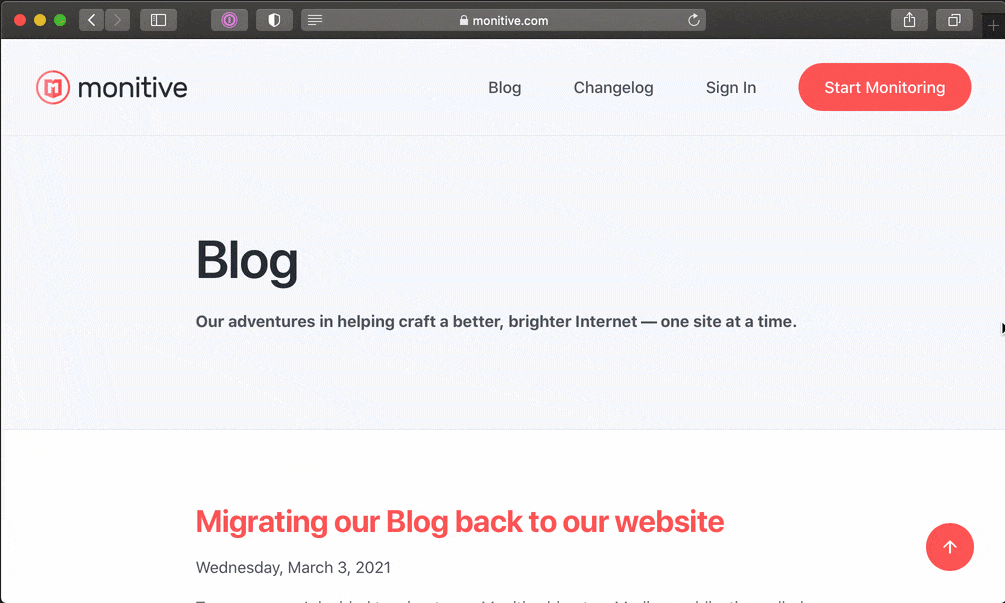
- desktop resolution, wide always-visible navigation items;
- mobile resolution, dropdown menu closed and hamburger menu icon visible;
- mobile resolution, dropdown menu open and close menu icon visible;
Switching between opened and closed states on the mobile resolution is done by clicking/tapping the hamburger/close icon.
Raising an eyebrow on how the mobile dropdown toggle works without a single Javascript statement? Hold on to your front-end hat, this is as simple as a walk in the park. A windy, responsive park.
The toggle works with a hidden checkbox, which we use to apply CSS based on its state. I won’t go into the details of it right now as you can easily inspect how this works.
Here is all the HTML for the navigation…
<nav class="navbar">
    <div class="container d-flex align-items-center justify-content-between flex-wrap">
        <a href="/">
            <img alt="Monitive" width="10rem" height="2.3rem" src="/img/logos/monitive.svg">
        </a>
        <input id="nav-toggle" type="checkbox" class="d-none">
        <label id="show-button" for="nav-toggle" class="d-flex align-items-center d-md-none mb-0">
            <svg style="height: auto; width: 1.5rem;" viewBox="0 0 20 20" xmlns="http://www.w3.org/2000/svg">
                <title>Menu Open</title>
                <path d="M0 3h20v2H0V3z m0 6h20v2H0V9z m0 6h20v2H0V0z" />
            </svg>
        </label>
        <label id="hide-button" for="nav-toggle" class="align-items-center mb-0">
            <svg style="height: auto; width: 1.5rem;" viewBox="0 0 20 20" xmlns="http://www.w3.org/2000/svg">
                <title>Menu Close</title>
                <polygon points="11 9 22 9 22 11 11 11 11 22 9 22 9 11 -2 11 -2 9 9 9 9 -2 11 -2"
                    transform="rotate(45 10 10)" />
            </svg>
        </label>

        <ul id="nav-menu" class="list-unstyled align-items-center d-md-flex m-0 p-0">
            <li class="my-2">
                <a href="/blog" class="sign-up btn">Blog</a>
            </li>
            <li class="my-2">
                <a href="/changelog" class="sign-up btn">Changelog</a>
            </li>
            <li class="my-2">
                <a href="/sign-in" class="sign-up btn">Sign In</a>
            </li>
            <li class="my-2">
                <a href="/sign-up" class="sign-up btn btn-primary ml-lg-3">Start Monitoring</a>
            </li>
        </ul>
    </div>
</nav>
The CSS goes something like this:
<style type="text/css">
    #hide-button {
        display: none;
    }
    #nav-menu {
        display: none;
    }
    input#nav-toggle:checked~label#show-button {
        display: none !important;
    }

    input#nav-toggle:checked~label#hide-button {
        display: flex !important;
    }

    input#nav-toggle:checked~#nav-menu {
        display: block !important;
        background-color: #ffffff;
        text-align: center;
        width: 100%;
    }
</style>
I was tempted to move the CSS into a proper .scss file but decided against that because critical CSS should go inline so the menu doesn’t dance around while the page is loading.
That’s it.
CSS toggles the display of the mobile menu based on the state of the hidden <input type="checkbox">. On bigger resolutions, the toggles are hidden and the navigation is displayed. Voilá!
No duplicated code.
No Javascript.
Just simple CSS. Feel free to even be animated however you like. CSS supports native animations as well.
Next time someone shows you a cool navigation bar, ask them if it uses Javascript. And “why”.