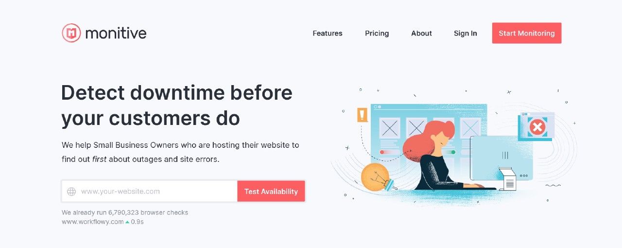
New Monitive website sneak peek
A sneak peek at how the new Monitive website will look like...

Last year, while we were coming up to the date of launching the new Monitive, I wanted a new homepage to go in harmony with the new service. As we were focusing 100% on finalizing the service, there were few resources for the actual website.
I only knew the following:
- the new website would need to be blazing fast, meaning we’d use a static site generator such as Gatsby, Hugo, or VuePress;
- it had to be simple, as we could always add things later;
- we had to choose a theme as we didn’t have time to go through the regular flow involving a designer;
So after about a week of research and brainstorming, we decided to go with Hugo static site generator, the Jumpstart theme by MediumRare and just a single landing homepage and the legal pages (privacy policy and terms of use).
That’s it. No bling-bling, no sparkles, just adapt the theme to our brand and we launched it.
Time for a refresh
As that was a temporary solution, this year we started to give the presentation website some real thought and started doing it right.
I knew the direction where we were going with the website, what it needed to have, and some ideas of what to put in.
Sneak peek
Without further ado, here is a sneak peek at how the new Monitive website will look like…

The hero part is focused on telling a visitor what can we do for them, and how is the service for.
Also, provide a simple way to run a quick test and demonstrate how our global checking system works.
Below the fold, we’re telling the Monitive story with all there is to it. The benefits, the features, real testimonials from our customers, pricing points, and latest updates from our Blog and Changelog.
I am very happy that all our customers are very happy with our service and I’m looking forward to raising awareness of how we’re helping craft a better, brighter Internet — one site at a time.
What do you think of our new website?
